TCS Home Product Page Redesign
Problems
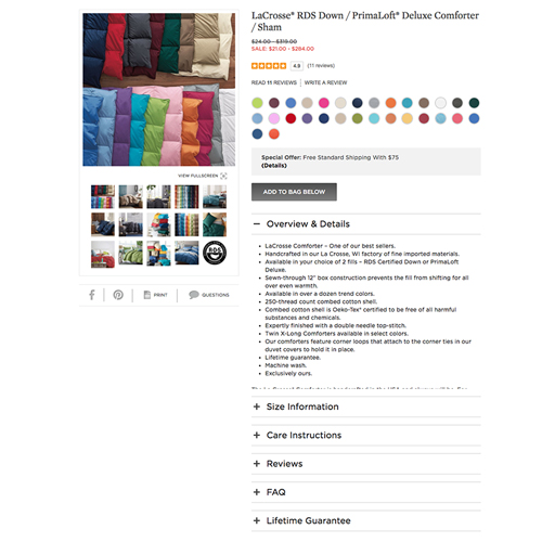
Products were set up in a way that were not user friendly and confusing to the customer.
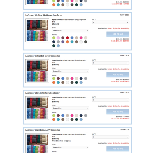
Solution
Research our assumptions and see how our customers complete tasks and interact with our website.
First step of research
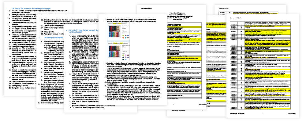
We first asked general questions to the people around us. We asked our co-workers what they thought about our product pages and gathered information internally.
User Testing
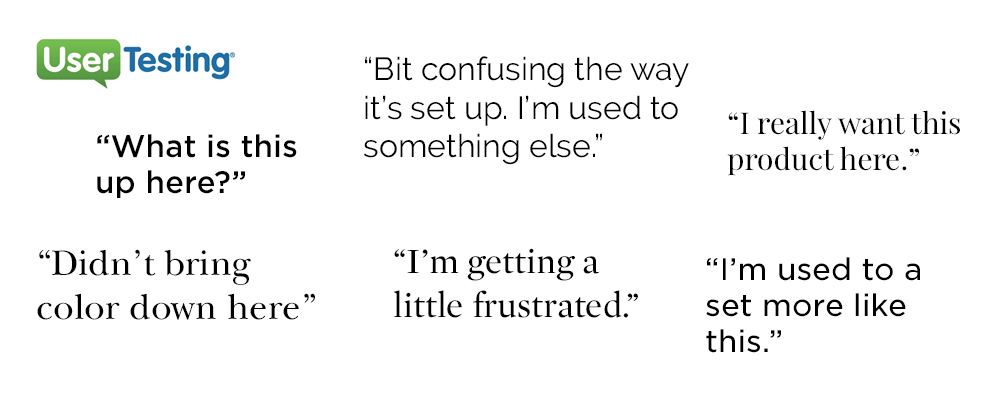
After we heard what the people had to say, we took the most important step and did some unbias user testing.
Conclusions from user testing
User testing proved to be the most useful research. A lot of our assumptions were correct but some weren't.
Rearrange our elements
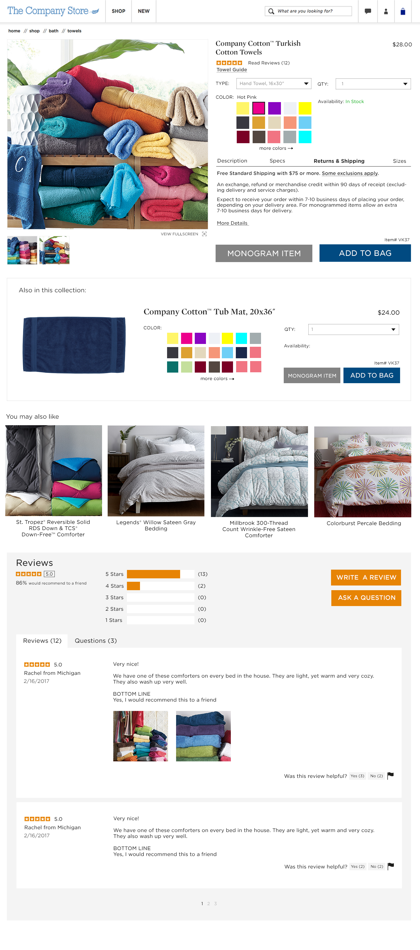
Based on our research we had to reorganize our information in a thoughtful and use friendly way. One of our biggest problems was to move the add to cart button to the top of the page.
Sketches
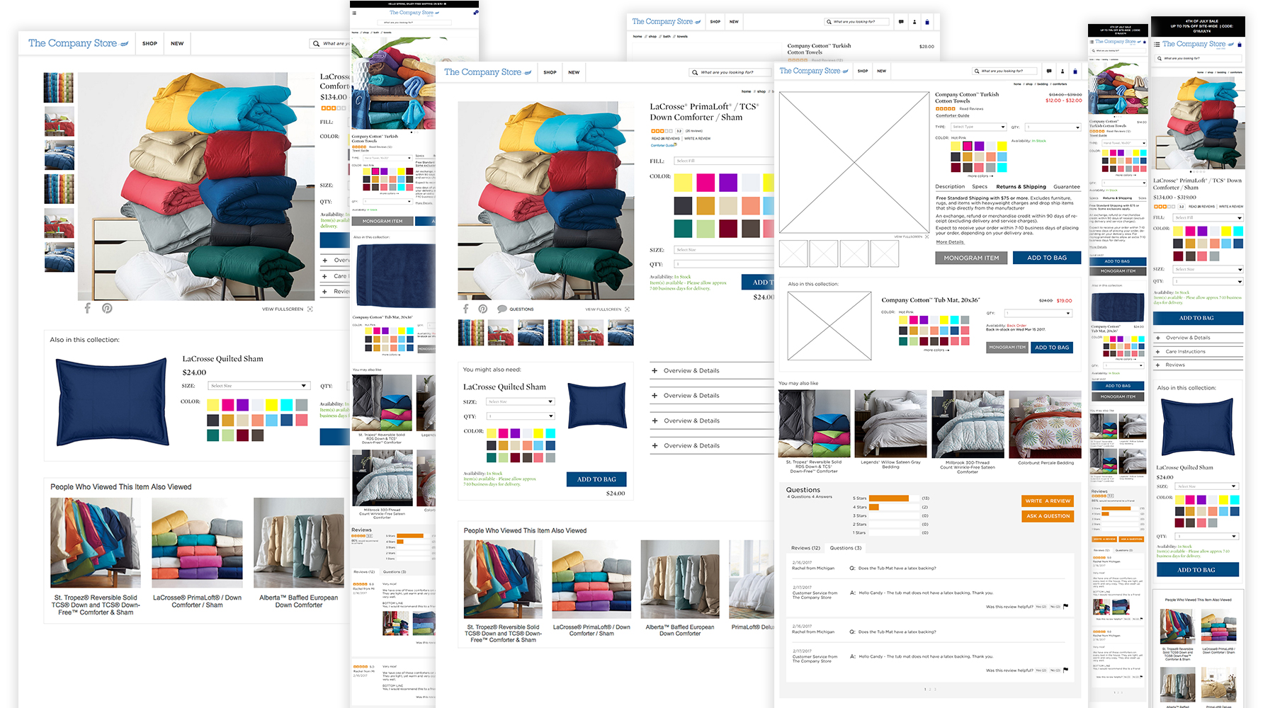
Above are a bunch of my iterations that I mocked up over the course of the project. Going through each section and thinking about how I can improve and make this product page as user friendly as possible.
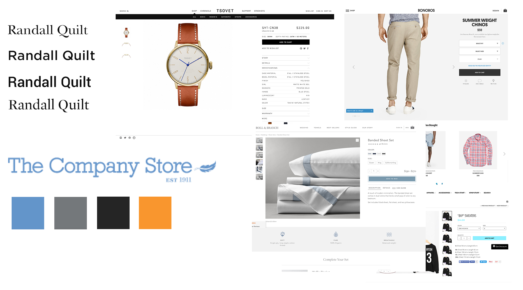
Inspiration
Our customers usually buy on desktop so that is where I focus most of my attention. But our website is responsive and more and more of our customers are getting accustomed to buying on mobile. So we also made a plan for how mobile will look and interact with the customer.
Final Mockups
