CStudio Home Product Page Redesign
Problems
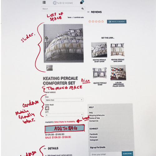
Design isn't fitting in with our demographic/competitors. Want to make the product information easy to read.
Solution
Redesign Cstudio Home product pages to be more user friendly. Focus on being mobile first, rearranging information that makes sense, and giving the page an updated look.
Little bit of user research
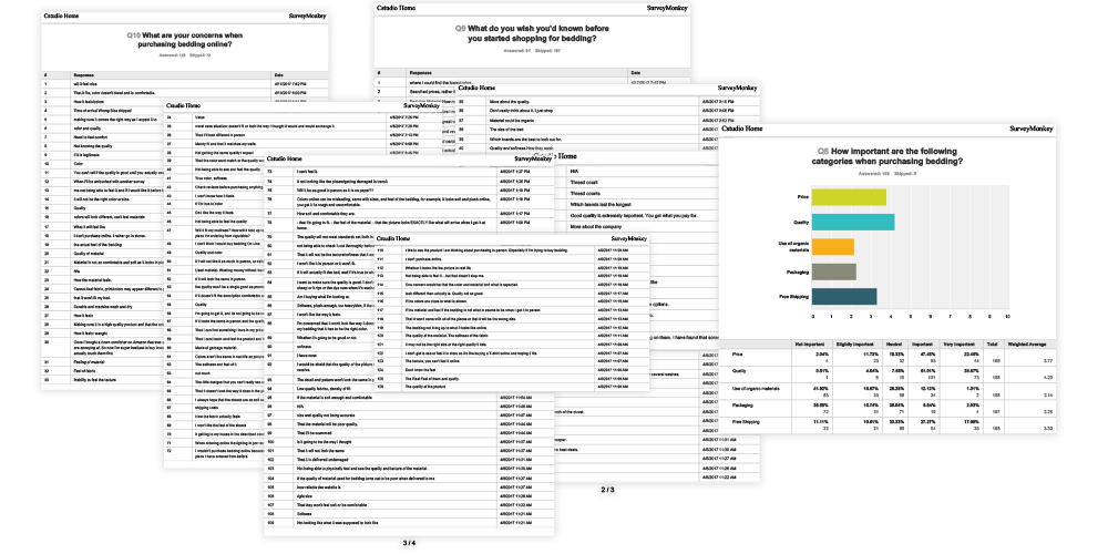
We did a quick, dirty, and simple survey to get some general information about our customers concerns with buying bedding.
The questions were: What do you wish you'd known before you started shopping for bedding? What are your concerns when purchasing bedding online. How important are the following categories when purchasing bedding?
Most people were concerned with price and quality.
Other concerns were color, the feel of bedding, care instructions, company relationship/trust, sizes, and shipping
Inspiration
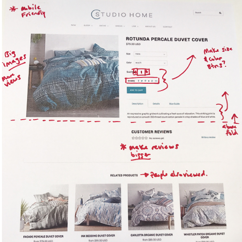
Rough Sketches
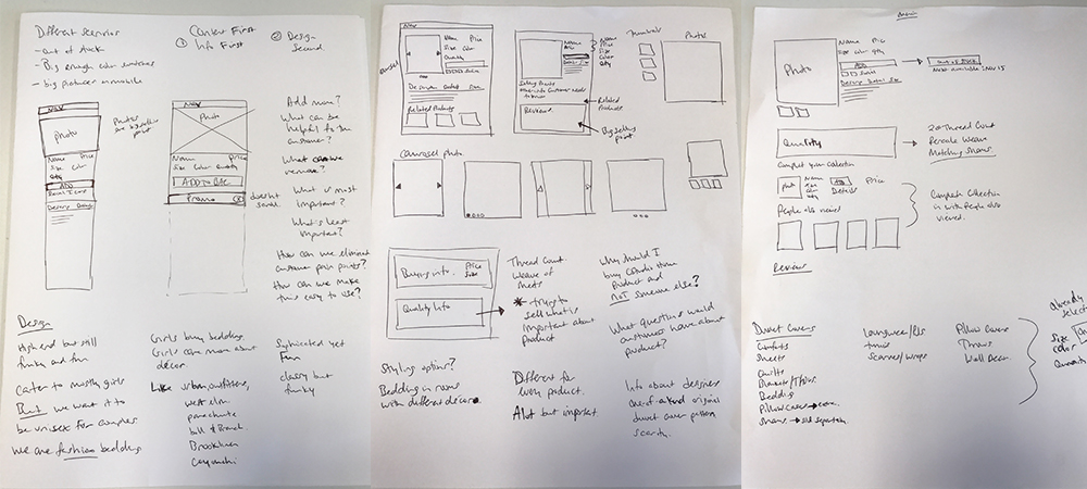
Mobile First
Our customers usually buy on desktop, so that is where I focused most of my attention. But our website is responsive and mobile is the future so at the very least I needed a plan for how mobile would look and interact with the customer.
Mockups For Approval
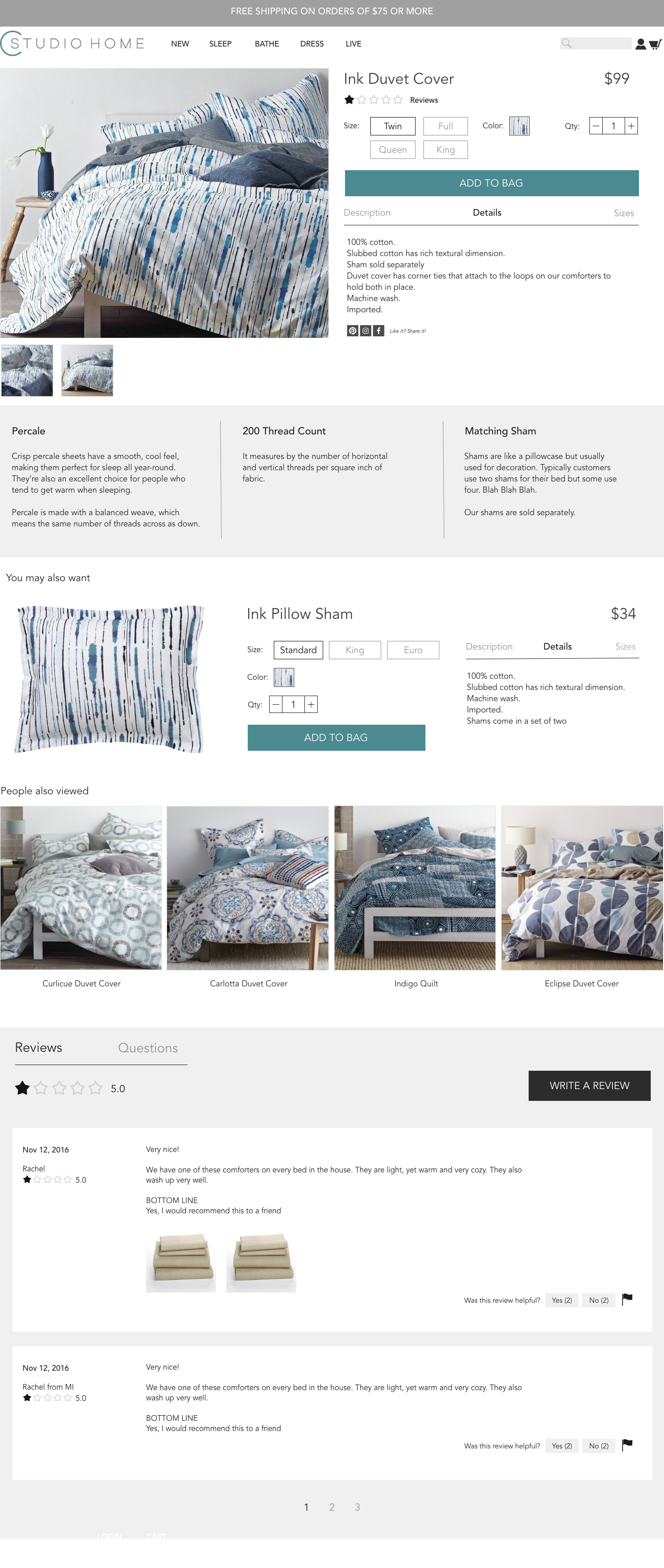
We wanted the images to sell the product, so we made the image section half the page.
Rearranged the information from most important to least to important, starting with the most important above the fold.
Focused on the page being mobile friendly, so I used boxes that you could highlight instead of dropdown menus.
So much information, so little space. Used a rollover navigation for all the information about the product.
